

Where are we in the Real Estate cycle?
Dig into the Data
2. Median U.S. Home Price ÷ Gold
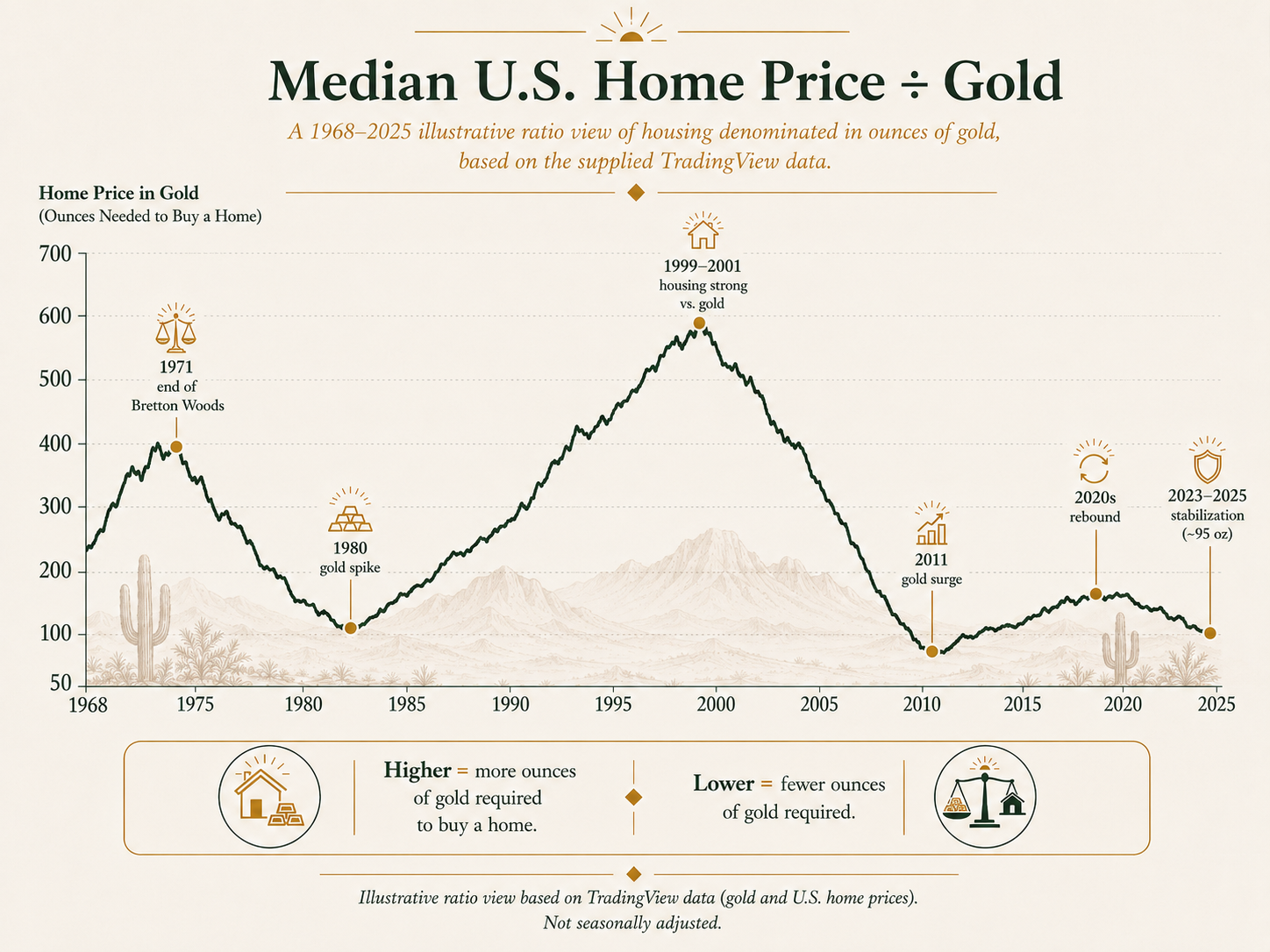
Gold has been a store-of-value for thousands of years, it has historically been viewed as a hedge against inflation. When we denominate home prices in ounces of gold, we are asking: how much real hard-asset value does it take to buy a home?
This chart shows that housing was much more expensive relative to gold around the late 1990s and early 2000s, then became significantly cheaper in gold terms after gold surged into the early 2010s. Recently, the median home price divided by gold is around 95 ounces, based on a roughly $433,000 median home price and gold around $4,540 per ounce.
The outcome: housing may feel expensive in dollars, but when priced in gold, it does not look historically extreme. That suggests part of the pain is not just “homes got expensive,” but that dollars have lost purchasing power.
If you read the news you are misinformed. if you ignore it you are uninformed. So, look at data and come to your own conclusions.
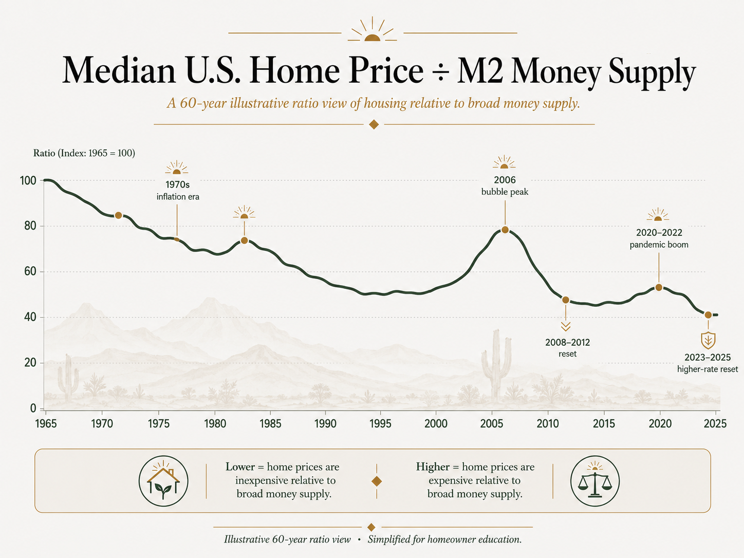
M2 is a broad measure of the money supply. It includes cash, checking deposits, savings deposits, money market funds, and other highly liquid forms of money.
When we compare median home prices to M2, we are asking: are homes expensive compared to the amount of money in the system?
Based on this chart, housing does not look wildly expensive relative to the total supply of money. The ratio rises during certain periods, especially around the early 1980s, the 2005–2006 bubble, and the pandemic housing boom, but it does not show the same extreme pressure we see when housing is compared to income.
The outcome is simple: compared to the amount of money that has been created, housing is not the main outlier.
1. Median U.S. Home Price ÷ M2 Money Supply
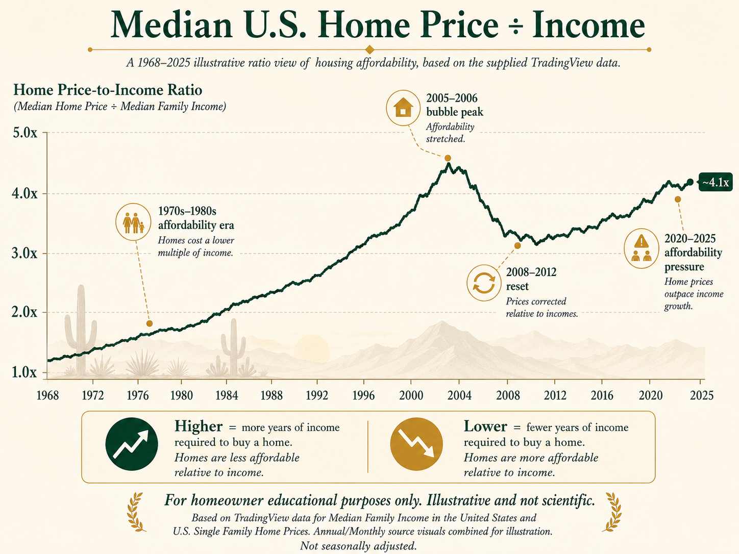
4. Median Home Price ÷ Median Family Income
This is where the affordability problem becomes much more obvious.
When we compare home prices to median family income, we are asking: how many years of family income does it take to buy a median home? The current ratio is roughly 4.1x, meaning a median home costs about 4.1 years of median family income.
This is significantly higher than many earlier periods. It shows that home prices have risen faster than family incomes, especially since the early 2000s and again after the pandemic. But family income can hide part of the problem because many modern households now depend on two incomes.
The outcome: even with more household labor, families are still struggling to keep up with home prices.
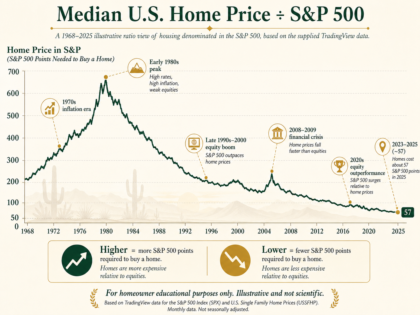
This chart compares housing to the S&P 500. It asks: how many S&P 500 index points does it take to buy the median home?
The long-term trend moves sharply lower. In the 1970s and early 1980s, homes required far more S&P 500 points because equities were weaker relative to housing. Today, the median home costs roughly 57 S&P 500 points, meaning equities have outpaced housing dramatically over time.
The outcome: compared to major financial assets, housing does not look unusually expensive. In fact, the S&P 500 has inflated far more aggressively than housing over the long run. This helps explain why people who already own assets feel wealthier, while people relying mostly on wages feel further behind.
3. Median Home Price ÷ S&P 500
Conclusion
Taken together, these charts tell a very different story than the one we usually hear.
Housing does not look wildly expensive when compared to M2, gold, or the S&P 500. In some of those comparisons, housing actually looks relatively reasonable. The deeper problem shows up when housing is compared to income, especially personal income.
That means the affordability crisis is not primarily about mortgage rates, even though rates absolutely make monthly payments harder. It is also not simply that houses are expensive in isolation. The bigger issue is that asset values have inflated while… incomes have not kept pace.
This is the real pressure families feel. We have more two-income households than previous generations, yet many families can afford less. That tells us the problem is not just the price of the house. It is the weakening of the dollar’s purchasing power and the widening gap between wages and assets.
As the dollar becomes a weaker store of value, people with capital are pushed into assets. Real estate becomes more than shelter. It becomes a savings vehicle, an inflation hedge, and a place to preserve purchasing power. Wealthier buyers and investors often do not want to hold too much cash because cash loses value over time. So they buy homes, land, stocks, gold, businesses, t bills, and other assets.
That creates a difficult cycle: asset owners are protected, while wage earners fall further behind.
So the clearest takeaway is this:
Housing affordability has not broken simply because homes are expensive. It has broken because incomes have failed to keep up with asset inflation, and the dollar buys less than it used to.
For everyday families, that means the path to home ownership is harder than it looks on paper. It now requires more income, more debt, more labor, and often two earners just to reach what one income could often support in the past.
Moral of the story - use your income to OWN ASSETS
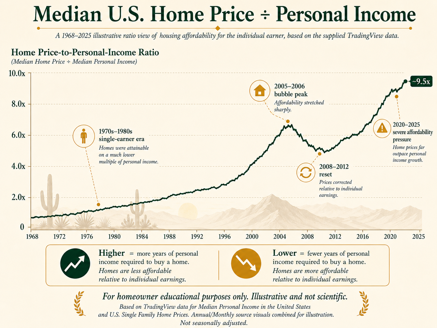
This may be the most important chart.
When we compare home prices to personal income, we are asking: how affordable is housing for the individual earner? That ratio is now around 9.5x, meaning the median home costs about 9.5 years of median personal income.
This completely changes the affordability conversation. In prior generations, many households could afford a home with one primary earner. Today, even with two earners, many families still feel stretched. This chart shows that the individual worker has lost enormous ground against housing prices.
The outcome: the real affordability crisis is not only about house prices. It is about the collapse of income purchasing power relative to assets.